Visualizing Satellite Imagery with Matplotlib
Taking a closer look at satellite data with Python
In the Inspecting Satellite Imagery Notebook, we learned how to use Rasterio to read and manipulate satellite data. There we also learned that, since satellite images are really grids of pixel-values, a satellite image can be interpreted as a multidimensional array of values.You can get the notebook here
You may already be familiar with the Python library matplotlib: here, we're going to briefly use that toolset to visually plot satellite data that has been read into a numpy array using Rasterio.
import rasterio
from matplotlib import pyplot as plt

# This notebook explores a single 4 band (blue, green, red, NIR) PlanetScope scene in a UTM projection.
image_file = "example.tif"

# Use Rasterio to open the image.
satdat = rasterio.open(image_file)
# Load the 4 bands into 2d arrays - recall that we previously learned PlanetScope band order is BGRN.
b, g, r, n = satdat.read()
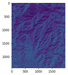
# Use imshow to load the blue band.
fig = plt.imshow(b)

# Display the results.
plt.show()

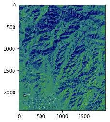
# Plot the green band using a non-default color ramp.
# https://matplotlib.org/users/colormaps.html
fig = plt.imshow(g)
fig.set_cmap('gist_earth')

# Display the results.
plt.show()

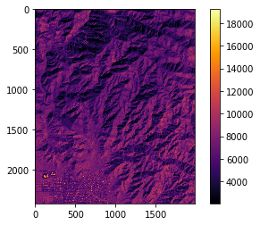
# Plot the red band and add a color bar.

fig = plt.imshow(r)
fig.set_cmap('inferno')
plt.colorbar()

# Display the results.
plt.show()

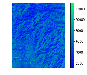
# Finally, plot the NIR band.
fig = plt.imshow(n)
fig.set_cmap('winter')
plt.colorbar()

# Since the axis labels are useless here, let's turn them off.
plt.axis('off')

# Display the results.
plt.show()
